
A huge variety of fonts can be used on a a computer. Understanding how they work can help you use them to best effect, and possibly prevent you from using too many in your documents.
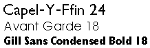
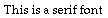
Most fonts are designed for a particular purpose. For example, a serif font, as shown in the examples below, is very easy to read in large blocks of text.
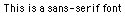
In contrast, a sans-serif font, as shown below, stands out in headlines and titles.
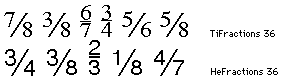
In addition, you may need special fonts for fractional characters, such as:-
or for foreign or specialised characters, as in:-
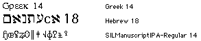
Unfortunately, in older fonts of the latter kind, there isn’t any correlation between the actual character and what you type on the keyboard. The last of the fonts illustrated above is used for the International Phonetic Alphabet (IPA), which requires a large number of strange characters.
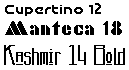
Decorative fonts can be eye-catching, although sometimes tricky to read. Examples include:-
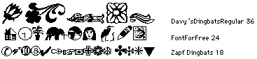
Finally, there are dingbat fonts that you can combine with text as an alternative to standard graphic elements. The following show a random selection of such characters:-
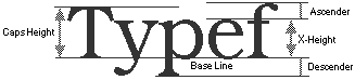
The diagram below shows some of the basic characteristics that define a font:-
The following diagram shows various parameters in more detail:-
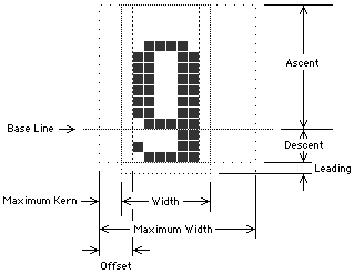
Some of these dimensions are defined as follows:-
For optimum legibility a balance must be struck between the continuity of each line of text and the variations that identify each character. The most important parameters are:-
The proportion of a font describes the ratio of its height to width. A font that has narrow letters allows you to view a line of words at a glance. However, if the characters are made too narrow each character becomes indistinct, making the text difficult to read.
The horizontal spaces between each character should be easy to see, but they shouldn’t break up the invisible ‘line’ that your eyes follow as they scan the text.
The vertical space between lines is known as banding. This leads the eye from one row to the next and is basically set by the height of a font’s lowercase letters.
The ascent of a font is set by the height of the uppercase letters and its numerals. In many fonts the lowercase letters are almost as high as the uppercase characters, which, when closely placed, can make the characters difficult to read.
Those parts of uppercase letters and numerals that extend above lowercase letters and the parts of lowercase letters beneath the baseline are known as ascenders or descenders. Both must stand out clearly between lines, although he ascenders are more important, since we read down the page.
The space between the top of the uppercase letters and the bottom of the descenders from the line above is known as leading, pronounced ‘ledding’. If there’s enough banding you can increase the leading, font ascent or both. Luckily, a large ascent looks elegant and doesn’t disturb the banding.
Characters are best defined by sharp edges. A serif font contains serifs, horizontal lines on the characters that add distinction and increase the apparent line density.
A sans-serif font, such as Geneva, can be more difficult to read than a serif font, but can be useful in confined spaces, as in lists or tables. Here’s an example:-
In a proportional font, such as Times, each character has a different width, apart from numerals which have identical widths to ensure alignment in columns of numbers. Here’s an example:-

In a monospaced font, such as Monaco or Courier, all characters, including punctuation and spaces, are of fixed width, as on an old-fashioned typewriter, which looks like this:-

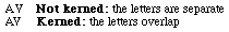
Some fonts automatically kern pairs of characters. The effect is shown below:-
In some instances you may need to apply manual kerning in order to improve the flow of text. You should apply this as follows:-
| Example | Character | Kerning |
|---|---|---|
| IM or | Two | Standard |
| HO or | Vertical | Slightly |
| OG or | Two | Tight |
| We or | Hanging | Very |
 Variations in Standard Characters
A ligature is created by tying together two characters, as in the following:-

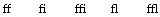
Ligatures are often used in place of characters that misbehave when placed next to each other. The most common character to cause problems is the letter f, particularly when followed by an i or l, since the ‘arch’ of this can collide with the next character in an unattractive manner. The problem is often solved by using the following ligatures in place of the matching character combinations:-
There are three ways of dealing with awkward character pairs:-
Most fonts provide numerals, also known as lining figures. All of the numbers in a character set should have the same width and height, usually of a height matching that of an uppercase letter, and shouldn’t usually have any ascenders or descenders. Such numerals are ideal for tabular data, although they’re not always attractive in a line of text. For example, in the following line:-

the numbers dominate the text, making the whole thing rather ‘lumpy’ and slightly difficult to read. Smaller characters, as used below, can look more elegant.

There are three ways of improving the appearance of numerals within text:-
f ligatures.Until recently, small caps were out of fashion. They do, however, remove much of the ‘lumpiness’ that can be introduced by modern acronyms. Consider the following statement with standard capitals:-

and compare it with the following which uses small caps:-

Small caps can also be used in titles, such as:-

You can create small caps as follows:-
f ligatures. Measuring Fonts
The standard measurement for printing is the point (pt). The European (Didot) point is 1⁄68 of an inch or 0.0147″. The printer’s point, used in the United States and the United Kingdom, is only 0.0138″, but on a Mac OS computer this is approximated to 1⁄72″ or 0.01389″. A monitor with a resolution of 72 dots per inch (dpi) shows each point as a individual pixel.
The following information is provided for reference:-
| Unit | Equals | |
|---|---|---|
| centimetre | 28.346 | 10 mm |
| inch | 72.27 | 72 pt |
| millimetre | 2.835 | |
| pica | 12 | For column |
| point | 0.351 | 0.0138 in |
| Q | 0.709 | 0.23 |
| Unit | Equals |
|---|---|
| em | Horizontal space as wide Often same as font size |
| en | Horizontal space as wide Usually half the size of an em |
The size of a font is defined as the distance from the top of the highest ascender to the bottom of the lowest descender. In most instances this should be equal to the distance from the baseline of one row of text to the next, assuming that special leading isn’t used (see below).
The line spacing or leading used with a font is measured between the baseline of each row. If lines are spaced by 14 points the line is said to use 14 point leading. The term 12/14 means that a 12-point font has been used with 14 point leading.
 Styles and Weights
The style of a font can significantly changes it’s appearance. With a PostScript font each style is usually treated as an entirely different font. With the TrueType system, however, a computer can create styled text by modifying a plain font. For example, italic text is produced by slanting a normal font at an angle. Although the results aren’t perfect, they’re certainly adequate for domestic use.
The weight of a font determines the thickness or heaviness of each character. Here are the common weight names used for PostScript fonts, given in ascending order:-
Ultra Light
Extra Light
Light
Roman, Book, Regular, Plain or Normal
Medium
Demi
Bold or Boldface
Extra Bold, Heavy or Black
Ultra Bold
The styles used in text are important if you want to create a slick presentation. Generally speaking, you should try to avoid using too many fonts and styles on any one page.
The following types of style are in common use:-
This can be useful for emphasising a word or phrase in a sentence, for highlighting foreign words or where a single a letter acts as a word, as in a mathematical equation.
Bold characters are essential for headings and titles where you need to gain the reader’s attention, although they can make reading difficult, especially if used within a flow of text.
This style has been inherited from the days of the typewriter. Unfortunately, it can upset the flow of reading, making it difficult to discern the text. Bold or Italic should always be used in preference.
You should always try to use a reasonable size of font, such as 12 point, when using these styles. A Mac OS computer automatically increases the leading when these styles are used, which means that uneven line spacing usually occurs unless you force the spacing to at least six lines per inch.
 Special Characters
A computer keyboard generates around 219 different characters, most of which can be reproduced by traditional PostScript and TrueType fonts, whilst the other characters and symbols for international languages can be generated using OpenType fonts.The following points are worth noting:-
€). You can use the word Euro or ECU (European Currency Unit), although the latter isn’t really the same thing. Better still, you can use a special Euro font that only contains this character.The following notes refer mainly to the Classic Mac OS.
Strictly speaking, a CR (carriage return) is a control code rather than a font character. Pressing Return on a computer generates this hard return, which forces the text onto a new line, even when you’re in the middle of a word.
However, by pressing Ctrl-Return you can produce a soft return, which is useful if you want to avoid awkward splits in the middle of words, although it can create ugly gaps in some lines.
Most fonts provide at least two sizes of horizontal space. Pressing Space produces a standard space, while Option-Space creates a non-breaking space (NBSP) that behaves in the same way as a letter. If you enter a NBSP in the middle of a word the text doesn’t wrap to the next line.
Some applications can create a short space (en-space) or a long space (em-space) whose width is normally equal to the letters n and m respectively. However, in some applications these codes are interpreted as being the same width as numerical zeros 0 and 00.
~ (tilde). You can then repeat the process to replace all of the tildes by a different kind of space or a pair of spaces.The short hyphen, or en-dash, equal in width to a letter n, is produced by pressing Option--. This character is longer and more attractive than the standard dash, which is more commonly used as a minus sign. In some instances, an en-dash is also used as a hard hyphen, or non-breaking hyphen, enabling hyphenated words to be kept together on a single line.
The long hyphen or em-dash usually has a width equal to the letter m, although its actual size can vary between fonts. This kind of dash, which produced by pressing Option-Shift--, should be presented with a space before and after it. However, these accompanying spaces should be of the non-breaking variety to prevent unwanted indents on new lines.
Curved single and double quote marks always look more professional than straight marks. You can usually generate these on a keyboard by pressing Option or Shift-Option along with the [ or ] keys. Fortunately, many types of word processor generate these smart quotes automatically, converting straight quotes into the curved variety as you type.
Most people use standard single and double quotes for feet and inches. However, these aren’t really correct. Instead, you should perform one of the following, as shown in order of preference:-
The ellipsis character (…) is produced by pressing Option-;, which is better than a string of full-stops (periods). If the character comes at the end of a sentence you should put any punctuation first. And you should avoid using spaces before or after an ellipsis, unless it’s at the end of a sentence.
This is the double-dot or bar that appears over a vowel that’s sounded separately, as in:-

In most fonts you can get this pressing Option-U followed by the required letter.
The keyboard on a Mac OS computer has a number deadkeys that come into effect when Option is pressed in combination with the keys marked E, I, U, N, or `.
Having pressed such a combination, nothing happens until you press another key combination. This is what happens when you carry on and press other key combinations:-
¨ accent with Option-U. Each time you use the same combination you’ll get the same accent, and you must press Delete twice to remove it.The standard deadkeys are:-
| Key | Accent | Letters | |
|---|---|---|---|
| E | ´ | Acute | a,e,i,o,u |
| ` | ` | Grave | a,e,i,o,u |
| I | ^ | Circumflex | a,e,i,o,u |
| U | ¨ | Diæresis or | a,e,i,o,u |
| N | ~ | Tilde | a,n,o |
The tilde, when not used with a letter, can appear on the mid-line level (as for a dash), allowing it be used as a standard maths or logic symbol, although some fonts always present it at a high position. You can also generate a high-position tilde by pressing Shift-` (see below).
If you have a word processor with overstrike you can use the following key combinations to generate an accent that can then be added to any suitable lowercase character:–
| Keys | Accent | |
|---|---|---|
| Shift-Option-M | ~ | Tilde |
| Shift-Option-, | ¯ | Macron |
| Option-H | ' | Dot |
On a Classic Mac OS computer you’ll find that the last four characters in every font can’t be used. These are represented by the numbers 252 to 255 (hex FC to FF), which aren’t normally generated by the keyboard. However, you can use a macro application such as KeyQuencer to produce these values, providing your chosen trigger keys aren’t used for other characters.
The following table shows how such characters can be generated using KeyQuencer:-
| Keys | Macro | Accent Name |
|---|---|---|
| ⌘-Ctrl- | Type "¸" | Cedilla |
| ⌘-Ctrl- | Type "˝" | Hungarian |
| ⌘-Ctrl- | Type "˛" | Ogonek |
| ⌘-Ctrl- | Type "ˇ" | Carib |
You can obtain each character for pasting into each macro by using a special utility such as PopChar Pro, although some macro applications allow you to enter the character directly as a number.
 Standard Mac OS Characters
The characters described below can be found in most fonts used with the Mac OS.
Many international characters can be produced by using the deadkeys (see above). Other characters can be generated by pressing one of the special key combinations shown below, although some of these don’t actually work with older versions of fonts or elderly editions of the Mac OS. To obtain the characters shown in the right-hand column you must also hold down the Shift key.
| Keys | Normal | Shift |
|---|---|---|
| Option-` | $ | Ÿ |
| Option-Q | œ | Œ |
| Option-T | † | Ê |
| Option-Y | ¥ | Á |
| Option-U | Ë | |
| Option-I | È | |
| Option-O | ø | Ø |
| Option-' | æ | Æ |
| Option-A | å | Å |
| Option-S | ß | Í |
| Option-D | ∂ | Î |
| Option-F | ƒ | Ï |
| Option-G | © | Ì |
| Option-H | ˙ | Ó |
| Option-J | ∆ | Ô |
| Option-L | ¬ | Ò |
| Option-; | … | Ú |
| Option-Z | Ω | Û |
| Option-X | ≈ | Ù |
The normal forms of quote marks are as follows:-
| Keys | Quote Mark | |
|---|---|---|
| Option-[ | “ | Open double |
| Shift-Option-[ | ” | Close double |
| Option-] | ‘ | Open single |
| Shift-Option-] | ’ | Close single |
although some countries use different characters to enclose text or for expressions, such as:-
| Keys | |
|---|---|
| Shift-Option-/ | ¿ |
| Option-1 | ¡ |
| Option-\ | « |
| Shift-Option-\ | » |
The different types of dashes and dots include:-
| Keys | Character | |
|---|---|---|
| Option-- | – | En-dash |
| Shift-Option-- | — | Em-dash |
| Shift-- | _ | Underscore |
| Option-; | … | Ellipsis |
| Option-H | ' | Elevated dot |
These characters can be used to mark the start or end of a section of text:-
| Keys | Character | |
|---|---|---|
| Shift-8 | * | Asterisk |
| Option-8 | • | Bullet |
| Option-T | † | Dagger |
| Shift-Option-7 | ‡ | Double-dagger |
| Shift-Option-V | ◊ | Lozenge |
| Shift-Option-K |  | Apple symbol |
Various currency symbols are available, although different results can be produced, depending on whether you’re using the British or US form of keyboard layout, as shown below:-
| Keys | British | US |
|---|---|---|
| Shift-3 | £ | # |
| Shift-4 | $ | $ |
| Option-3 | # | £ |
| Option-4 | ¢ | ¢ |
| Option-Y | ¥ | ¥ |
| Shift-Option-2 | € | € |
€) is only available in modern versions of fonts.Numerous characters, some of which are also used for other purposes, are used in arithmetic and maths. The following are used for arithmetical operations:-
| Keys | Meaning | |
|---|---|---|
| Shift-= | + | Addition |
| Option-- | – | Subtraction |
| Shift-Option-= | ± | Plus or minus |
| Shift-8 | * | Multiplication |
| Option-/ | ÷ | Division |
| Shift-6 | ^ | Raised to |
| Shift-1 | ! | Shriek value |
while the following symbols are used to express relationships:-
| Keys | Meaning | |
|---|---|---|
| = | = | Equal to |
| Option-= | ≠ | Not equal to |
| Option-X | ≈ | Approximately |
| Shift-, | < | Less than |
| Shift-. | > | Greater than |
| Option-, | ≤ | Less than |
| Option-. | ≥ | More than |
| Option-\ | « | Much less than |
| Shift-Option-\ | » | Much greater |
and the following special symbols are used in calculus and logic:-
| Keys | Meaning | |
|---|---|---|
| Option-B | ∫ | Integral |
| Option-D | ∂ | Part |
| Option-J | ∆ | Rate of change |
| Option-F | ƒ | Function |
| Option-V | √ | Square root |
| Option-W | ∑ | Summation (Sigma) |
| Option-L | ¬ | Logical NOT |
The final set of characters in this section are used for various purposes:-
| Keys | Meaning | |
|---|---|---|
| Shift-Option-8 | ° | Degrees of |
| Option-M | µ | Small amount |
| Option-5 | ∞ | Infinity |
| Option-P | π | Small pi |
| Shift-Option-P | ∏ | Large pi |
| Option-Z | Ω | Impedance in |
The size of a numbers in a fraction should be just over half the size of a standard character. For example, fractional characters in 12-point text should be in a 7-point font while those in 10-point text should be 5.5-point or 6-point. You should use a superscript font for the top number and press Option-Shift-1 in the regular font size to get a slash at the correct steeper angle. Note, however, that this kind of slash appears almost vertical when used for an on-screen presentation.
The following special characters are commonly used in printing:-
| Keys | Character | |
|---|---|---|
| Option-6 | § | Section |
| Option-7 | ¶ | Paragraph |
| Option-2 | ™ | Trade Mark |
| Option-R | ® | Registered Mark |
| Option-G | © | Copyright |
©Ray White 2004.
